Banchan Kitchen
Type: Branding
Duration: 1 Month
Advisor: Rebecca Leffell Koren
A branding project based around an iconographic system.
Banchan are Korean small plates that are often served before and with meals. The goal of this project was to create an icon system to indicate different banchan while also extending the design system to other collateral.


Process
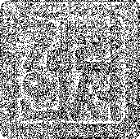
The challenge of developing an iconographic system is balancing the line of physical depiction and conceptual depiction. Much of the process below deals with the abstraction of the plate, and finding a balance between the weight of the frame and the subject inside it.
Thematically, I wanted to incorporate traditional Korean colors and shapes to bring forth a connection to the rich culture behind Korean food. Korean pottery, weaving, and danchong patterns informed the design choices to come to the final deliverables.
When set to table, banchan dishes form an array or pattern of bright colors, tastes, and an identity for Koreans. Thinking of the plate as a frame for Korean culture, there is a connection of the plate to Korean history and the culinary culture of banchan.


Iteratively, I approached the plate as a way to frame food and incorporate traditional Korean design. Using negative space, the designs gravitate toward a ‘paper punch out’ graphic approach, adding a modern graphic feel to the shapes. Lastly, I focused on incorporating variations to the icons, accounting for the use case of the icons as patterns or design elements. The bottom right set shows this, inverting the colors and making use of the plate as the primary element.


Design Collateral
The final step was to extend this system over different design collateral, using Banchan Kitchen as the concept for this project.


